Impact dashboard
Find hotspots with the Overview, Impact Source, Intensity Matrix, and By Pressure cards.
The dashboard shows how large your impact is, where it comes from, and what drives it. Each card has its own controls and an export button. See Measure impacts for the Nature and Climate lenses and the Display control.
Overview card
The Overview card shows your total impact for the reporting period.
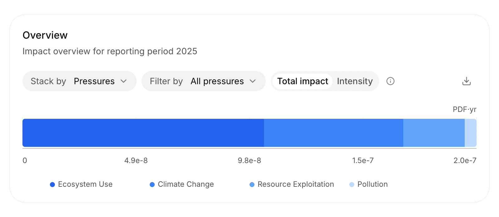
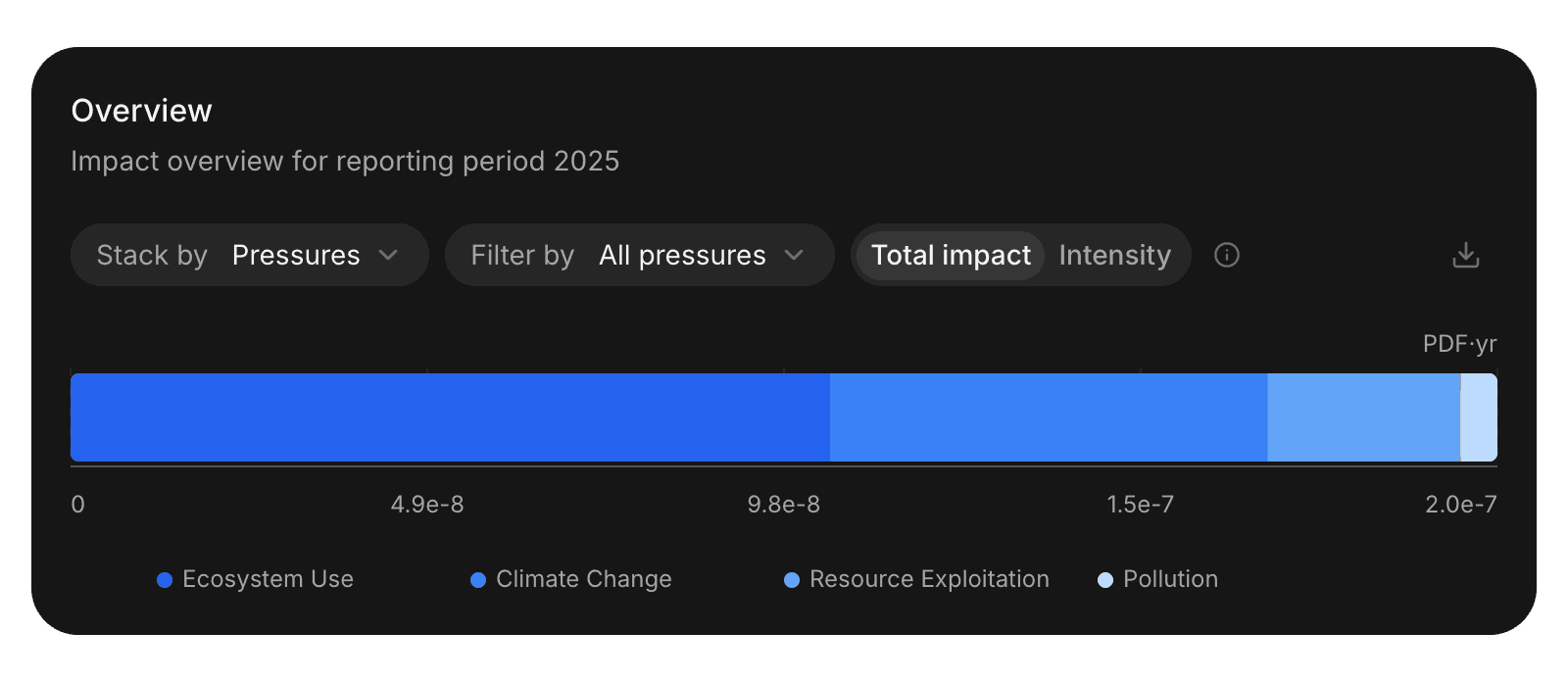
- Display: Total impact or Intensity.
- Stack by: Split the bar by Pressures or Ecosystems. Nature only.
- Filter by: Show one pressure category or one ecosystem. Nature only.
Impact Source card
The Impact Source card, Emission Source on Climate, ranks what contributes most, with each source's spend and share.
Choose the source in each table:
| Source | Ranks by |
|---|---|
| Goods & Services | Activity |
| Suppliers | Supplier |
| Countries | Country of production |
| Entity | Organization entity |
| Asset | Asset name |
| Your custom columns | The categories in each custom column, unless its Show in is set to None, see Views and filters |
Add card adds another table, so you can see several sources side by side.
Intensity Matrix
The Intensity Matrix plots each source's intensity against its total impact, or against its spend with Y-axis set to Total spend. Both axes are logarithmic, so small and large sources fit on one chart. Dotted lines mark the medians.
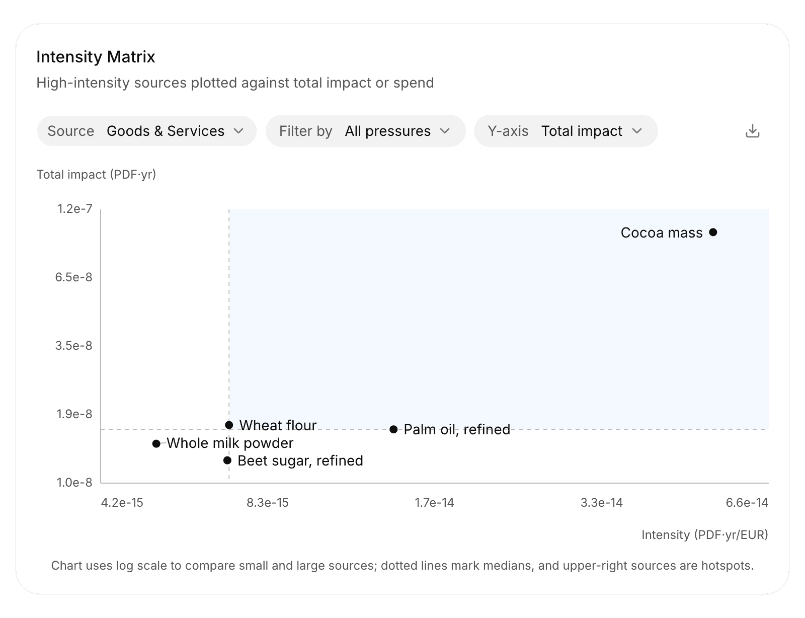
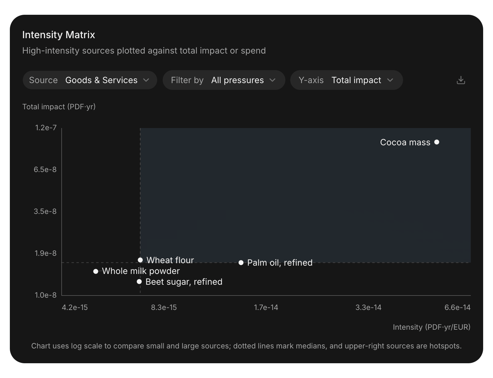
Sources in the upper right are hotspots: large and intense. Example: Cocoa mass sits in the upper right of the Aamu Foods results. It's a large purchase, and each euro spent on it carries a high biodiversity impact, so it's the first place to look for supplier data or alternatives.
Sources in the lower right are intense but small. Sources in the upper left are large because you spend a lot on them, not because each euro carries a high impact.
By Pressure
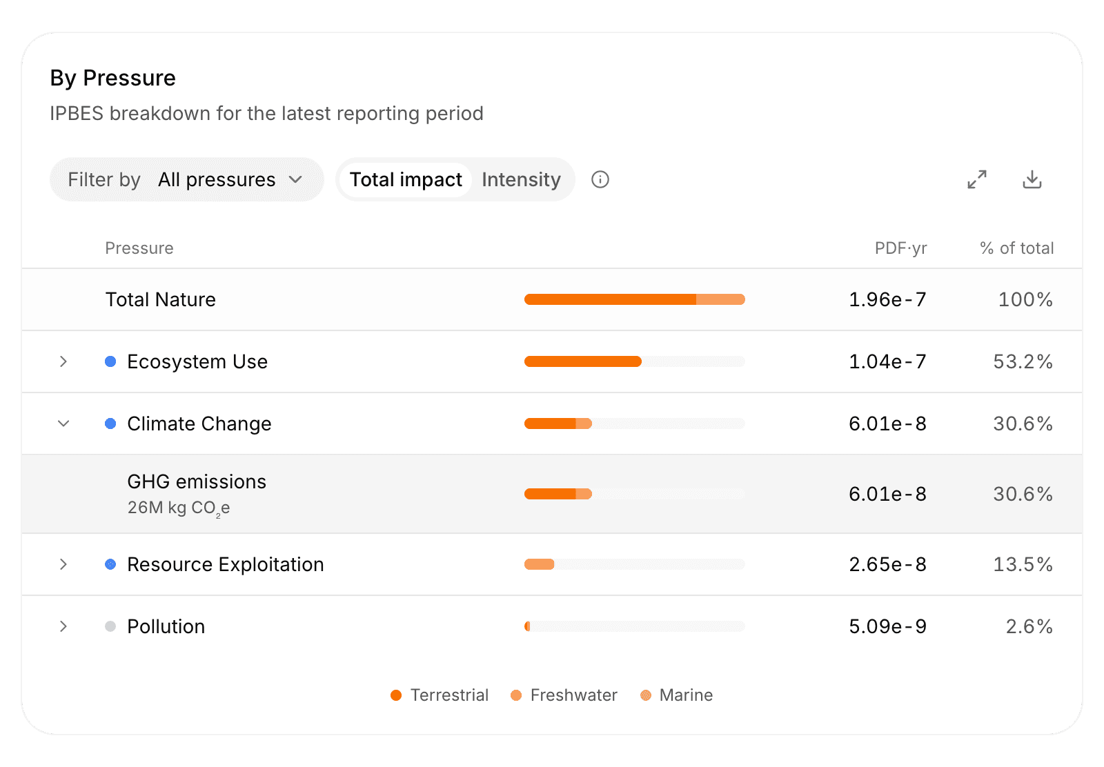
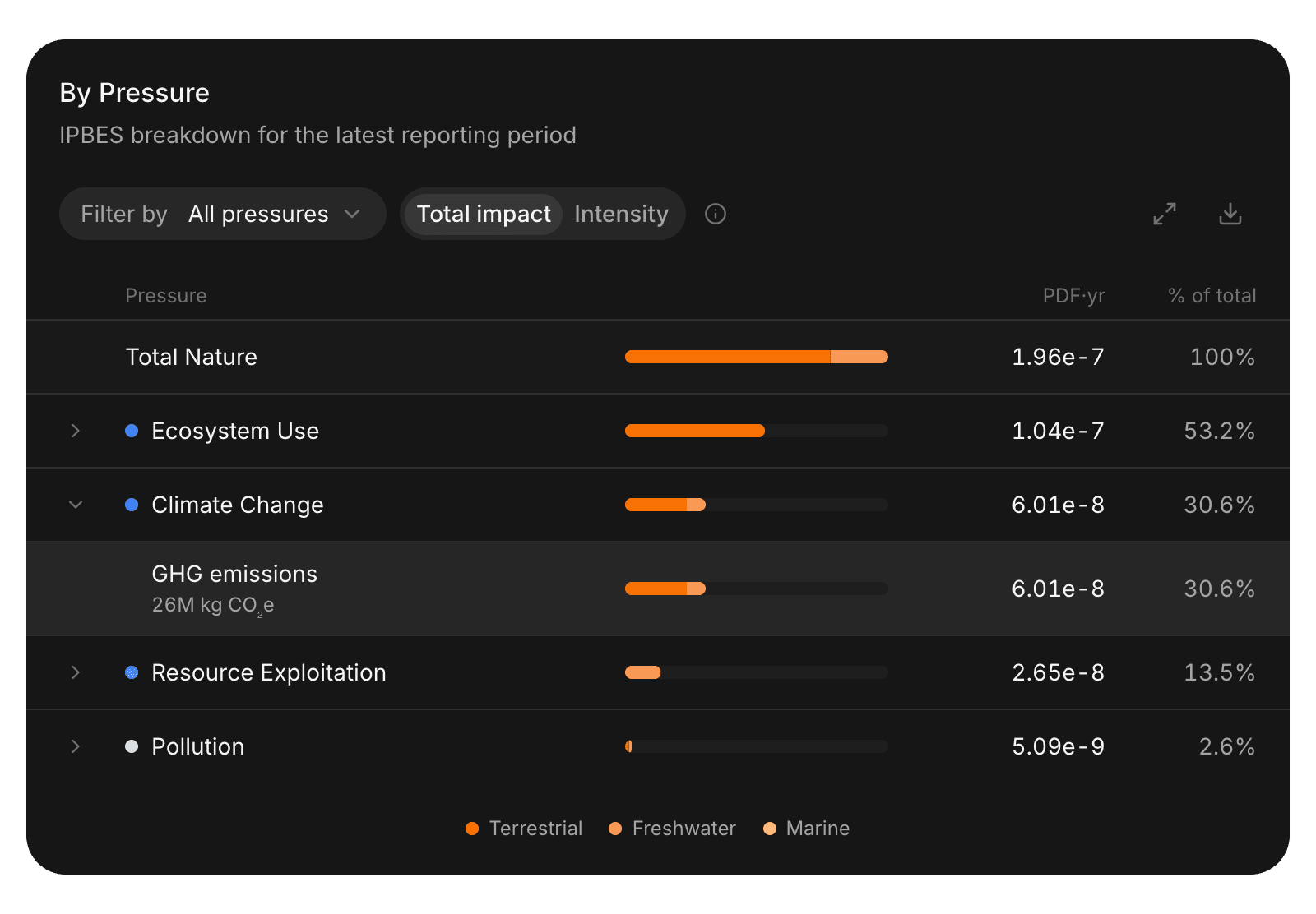
The By Pressure card, Nature only, breaks your impact down by the four pressure categories: Ecosystem Use, Climate Change, Resource Exploitation, and Pollution. Each category lists its environmental pressures (metrics) with their amount before characterization, such as m² of land or kg CO₂e, and their impact in PDF·yr.
See the Metrics reference for every pressure.
Compare with project
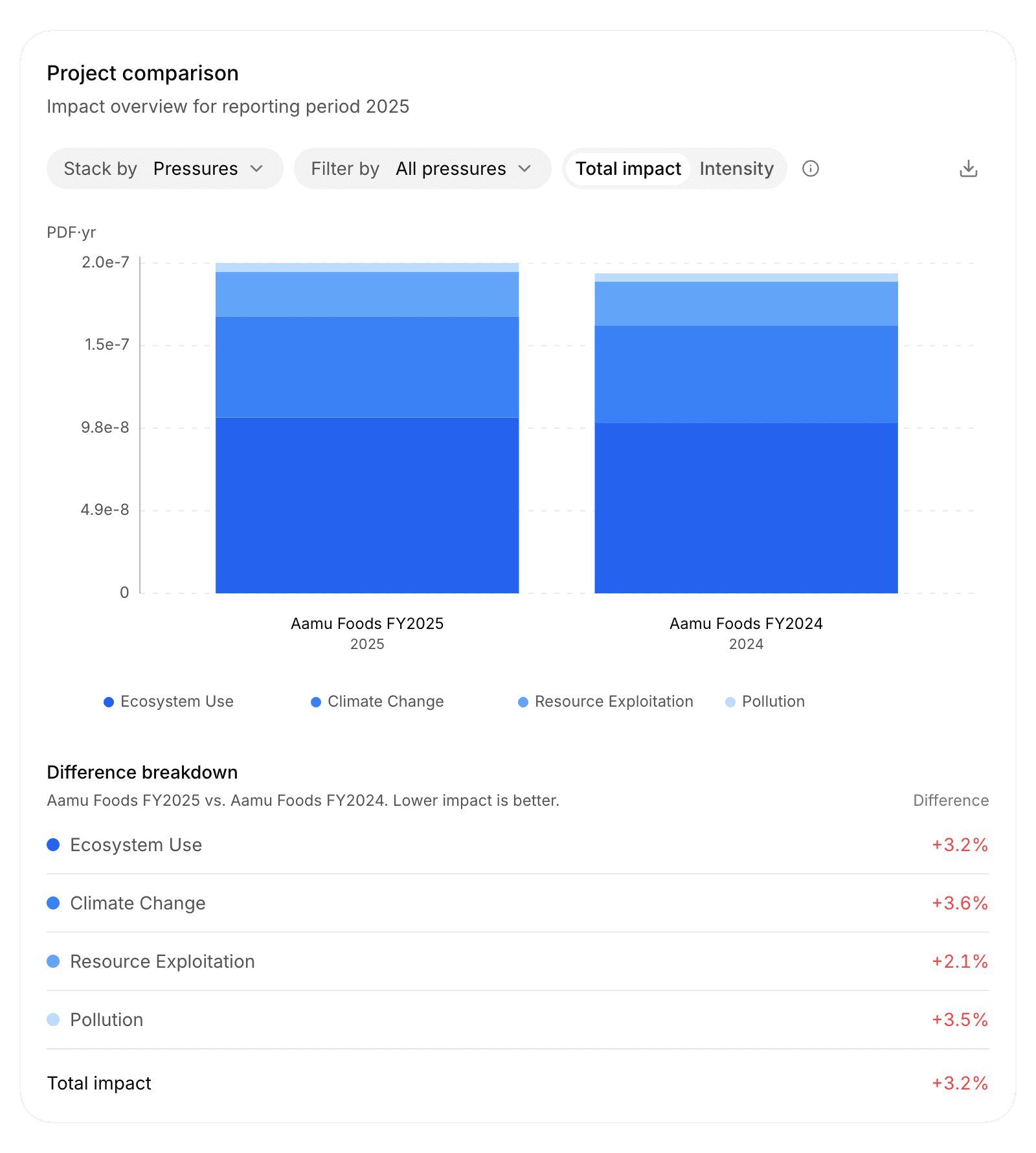
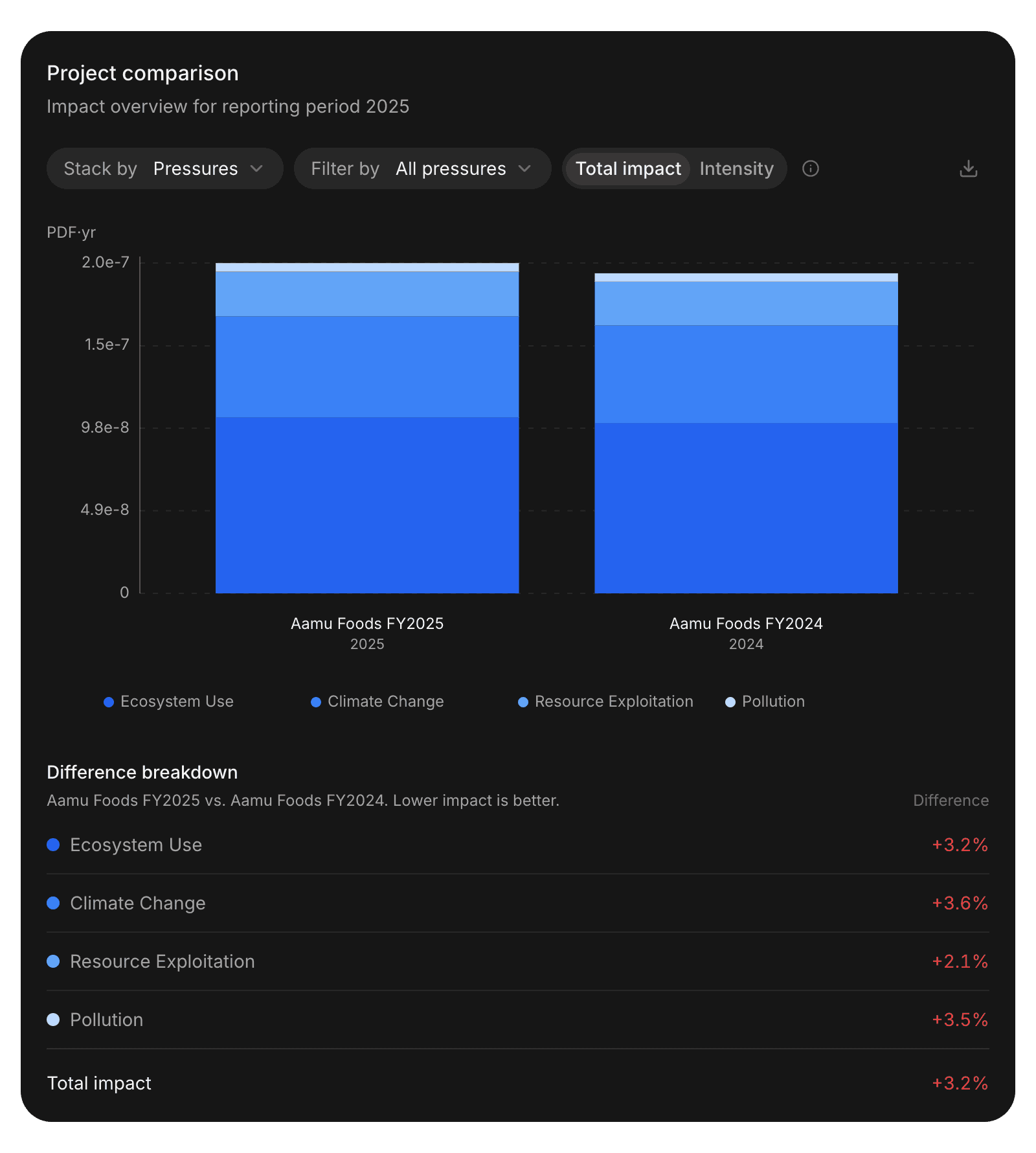
Compare with project shows other projects next to the current one, for example last year's. Select one or more projects in its menu. The Overview card becomes Project comparison and shows the Difference.
Compare projects with the same settings and factor datasets. Otherwise a difference can come from the settings rather than your purchases. See Project settings.
Where to start
- Check the Coverage tab before you share a number.
- Rank Goods & Services in the Impact Source card to find your largest contributors.
- Switch the source to Countries and Suppliers to see where the impact happens.
- Use the Intensity Matrix to tell large purchases from intense ones.